The SHU Development Process (shu-dev) is a website used within the Department of Computing at Sheffield Hallam University. Based on the generic process framework described by Pressman and Maxim1, it details different project stages commonly seen in software engineering, and therefore throughout student studies.
The project is student-led and previous efforts focussed on building content. I was the sole developer throughout my involvement. The project was a collection of documents on a code repository when I joined, which meant the information was hard to access and navigate.
An alternative to this page was submitted as a reflective account for a module. It was written shortly before I finished on the project and prior to it being accepted to the UKICER conference. Read my reflective-account.
Aims
Project
- Provide course and technology agnostic documentation for students to reference throughout their studies (though a focus was given to project-based modules where all software development processes are covered).
- Reduce content duplication across modules (some topics were covered more than once to ensure all students know them).
- Improve student experience
Personal
- Explore a suitable framework with a view to expanding my web development capabilities.
- Increase my experience of research processes, including academic writing and presentations.
Putting the Documentation Online
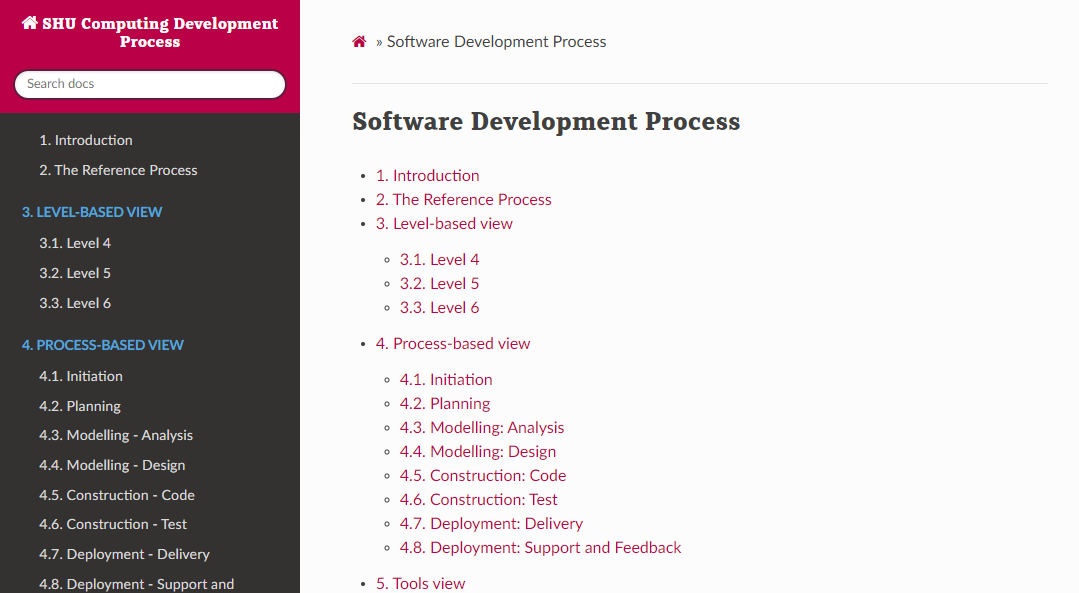
The legacy site
The first attempt at putting the documentation online was completed with MkDocs. It allowed me to act quickly and the pre-built ‘readthedocs’ theme was “good enough”. This meant the site could be put online in time to introduce it to students in their project-based modules in the second semester.
The content had previously been split into two ‘views’. One divided pages by level of study and the other by complete process. The intention was to give students the choice of only looking at what they need currently, or understanding a process in its entirety.
The feedback received on this version was largely good, however students said it was confusing to navigate because they weren’t sure which view they should be looking at. This mirrored the experience of authoring content because it had to be created and updated in two places. The second major theme of feedback was accessibility issues.
Updating the Site
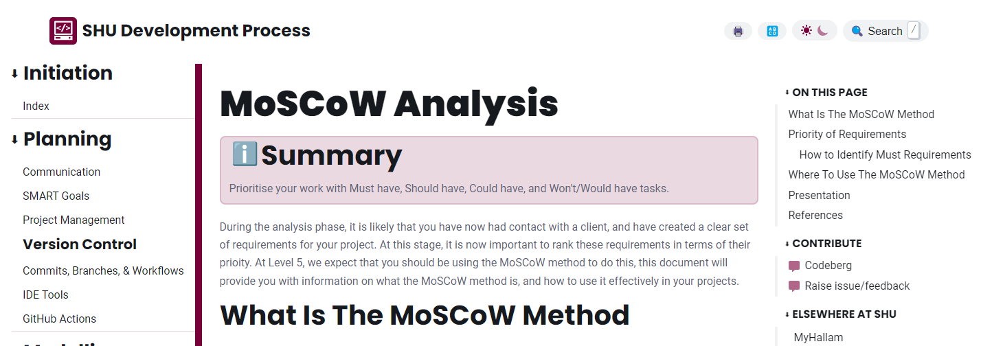
The AstroJS site
Based on the feedback we received and plans already in place, I built a new version of the site. Astro was selected to replace MkDocs for a number of reasons:
- Developer experience is familiar.
- Changes to the old site were done by overwriting Jinja2 handlebar templates. They’re clunky.
- Astro aligns with popular frameworks like React and Vue.
- Hopefully, future students adopting the project can understand the codebase quickly.
- Layout and design is easier to customize.
- Accessibility is easier to focus on.
- Functionality is easier to extend, through ‘npm’ packages or remark and rehype plugins.
Development began with a pre-built ‘documentation’ theme (now succeeded by Starlight) and colors were customized to better match university branding. Content was re-structured to only the process-based view, removing duplication and reducing the number of overall documents. After that, a number of new features were implemented.
Search
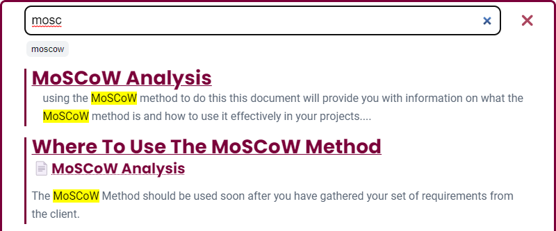
- A first-party search tool was created to avoid the overheads of cost and privacy seen with existing solutions.
- An index of search documents is created on every build using a rehype plugin. It extracts plain text between each heading on a page.
- The MiniSearch library was used because:
- It’s fast
- It supports fuzzy-matching (for handling typos)
- It can provide search suggestions
- It works completely client-side
- Result ranking can be customized.
- Custom JavaScript code handled search and rendering:
- Keyboard shortcuts display a custom ‘dialog’ element.
- If no search results are found, use the first suggestion from MiniSearch to search again.
- Use regular expressions to highlight search terms within results.
- Display the section heading a result was found in, as well as the page it is on.
- Enable Sitelinks searchbox and address bar shortcuts with the ‘lucky’ URL parameter.
Content Filtering
A dropdown control below the title of every page allows inline content to be filtered to specific levels of study. Levels 4, 5, and 6 correspond to first, second, and third years of an undergraduate course.
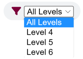

Sharing Content
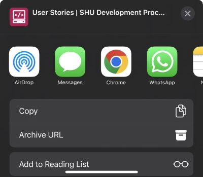
Each heading on the site includes a hashtag link next to it so that it can easily be shared with other students. On devices that support it the share API is used to make finding contacts and apps easier, otherwise it is copied to the clipboard.

Accessibility
- The site is compliant with WCAG2.1 recommendations. This was checked using axe DevTools and WAVE.
- A dyslexia-friendly font can be toggled from a button in the site header, so that users who struggle reading the defaults (Poppins and Roboto) can still digest the information.
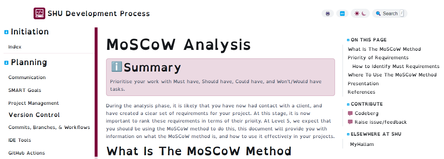
The OpenDyslexia font is enabled
Mobile Access
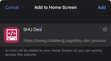
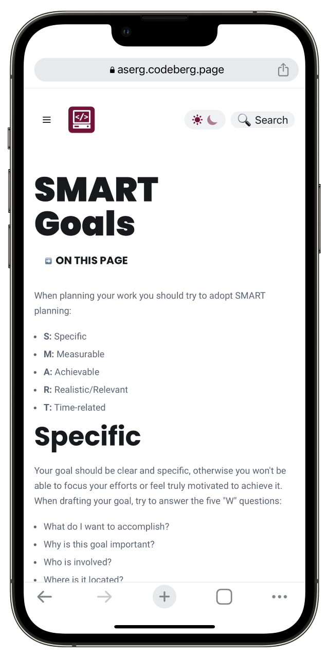
As with all well-designed sites, it’s completely mobile responsive. This means students can easily access it from a smartphone or tablet.
Print Stylesheet
One of the most suitable ways to provide site content in an alternative format is to implement a print stylesheet. This removed the header and navigation elements so content can easily be read in third-party applications as a PDF or printed onto paper.
Writing Guide
Students wanted to know what to expect when they look at a page, as well as where they can go for more information. To aid this and improve the cognitive accessibility of the site, I created a writing guide that can be followed by others when updating or creating content. It includes details of:
- Easy Read considerations
- How to avoid or explain jargon and technical terms.
- Syntax Considerations
- Adding filters so content can be target specific year groups
- Embedding mermaid diagrams.
- Required content and section headings
Testing
- Due to the then-recent release of it’s GUI mode, Playwright was selected as the tool for testing.
- Tests covered accessibility (using lighthouse-ci), content filtering, and search.
- Unfortunately, I ran out of time to implement tests for content guidelines (see writing guide above) and broken link checking. This will continue with the next developer(s).
Site Evaluation
Feedback about the website was collected using an online survey. It used a mixture of Likert scales and qualitative comments. Thematic analysis was used to summarize text responses. Computing students were asked about:
- document quality
- presentation, layout and navigation
- levels of detail
- if it improved their understanding of software development processes
- future use
- improvements that could be made
- the amount of time they spent using the site
Results were largely positive and justified further development of the entire project.
Analytics
Plausible analytics anonymously track which pages users are visiting. This includes 404 pages and terms they search for. Monitoring these enabled me to fix broken links, and let the research team know which content may need more attention during teaching, either to ensure the site is up-to-date or to cover in seminars and lectures.
Project Evaluation
Through the project, I bolstered my web development experience with a comprehensive framework and learned about the significance of both physical and cognitive accessibility on the web. Along with encouraging survey results, students reported that the filter controls were useful for them and I developed the features so they may be extracted. This means I can bring my learning forward to future projects. During my time on shu-dev, I had another role supporting academics in the delivery of their seminars, where I saw first-hand how useful it can be in a classroom. I used it to help explain specific processes to students and pointed them towards the site when they were stuck on what to consider next.
University policies limited the amount of personal information we could collect about students - with good reason too. Information was kept anonymous. However, a package like Hotjar could collect heatmaps and behavioral analytics to further inform teaching staff about site use and content students are interested in. I would have liked to implement an inline feedback widget so that users could tell the research team what they thought about the site as they navigated through it. This was vetoed due to valid concerns about spam and collection of feedback not relevant to the project.
My experience didn’t go unnoticed. After being incrementally introduced to project-based modules between 2022 and 2023, shu-dev is set to be integrated across the entire Computer Science and Software Engineering subject group in the 2023/24 academic year. It will continue to serve as a useful resource for student work. Additionally, I presented the project at an internal learning, teaching, and assessment conference2 and co-authored the work as an academic experience paper. This will be presented at the UKICER 2023 conference, which focuses on computer science education.
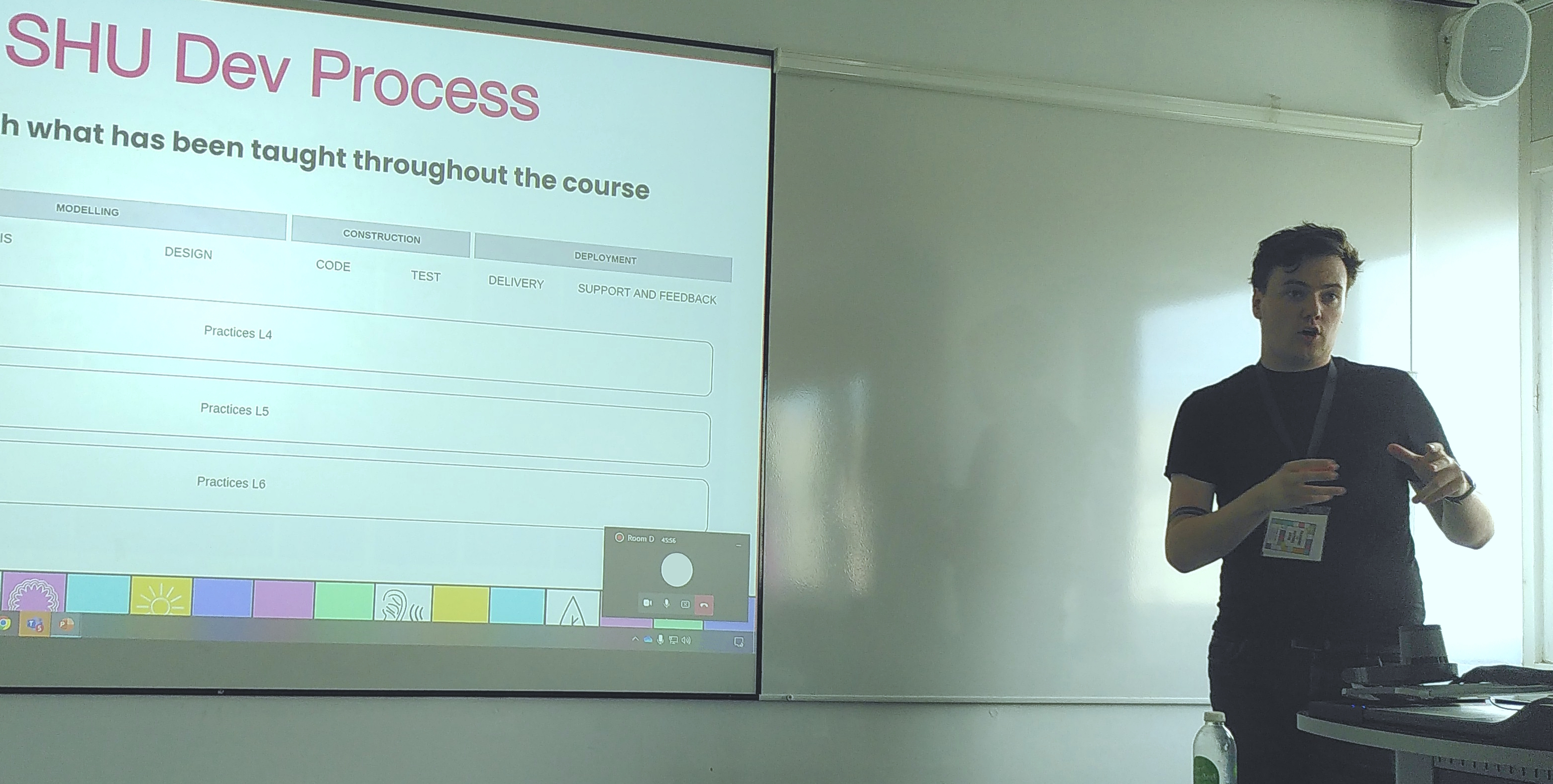
Presenting the SHU Development Process at an internal conference.
Future
I hope the automated testing is finished in the future. Automatically providing content suggestions based on Easy Read guidelines or other rules is something that can be done with tools like ProWritingAid, Grammarly, and others, but building them into the authoring process is a great way to streamline the work and ensure they are followed. Accessibility is also set to be improved through the introduction of Text-to-Speech functionality. The 2023/24 academic year marks the first time that it will be possible to track feedback across cohorts as they progress through their degrees, opening analysis up to reliable comparisons over time.
The project will continue under the Applied Software Engineering Group at the university.
References
[1] Pressman, R. S., & Maxim, B. R. (2010). Software engineering: A practitioner’s approach (7th ed.). McGraw-Hill Higher Education. [2] ASERG at the SHU Learning, Teaching and Assessment 2022 Conference - https://aserg.codeberg.page/news/2022-09-15-SHU-Dev-Process-LTA-Conference/
